

I have already reviewed a handful of Noodlers ink products and you can access these by clicking the following links: Noodlers Inks are different! , Noodlers Ink Review – Magic Browns and Greens and Noodler’s Ink Review – Reds
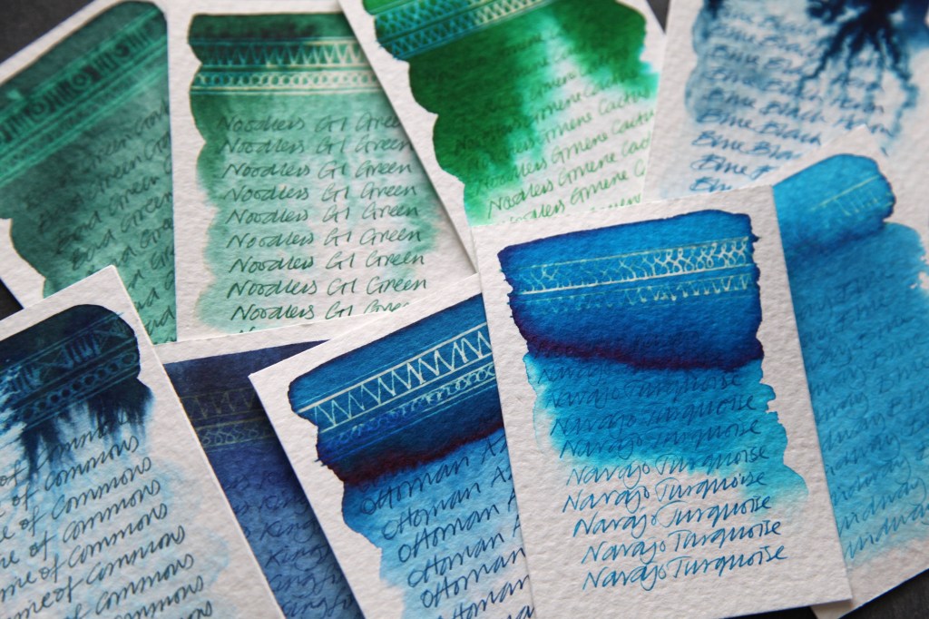
Ottoman Azur – A deep dark blue that doesn’t bleed easily when added to water but does wash out a steady gradation of the blue. No hidden hues. Limited reaction to bleach. A dark rich blue colour when used for writing.
Navajo Turquoise – An uneven turquoise that doesn’t bleed easily when added to water but does wash out with bright cyans at the edges. No other hidden hues. Limited reaction to bleach. An uneven turquoise colour when used for writing.
Midway Blue – A strange weak turquoise that bleeds easily when added to water. There are some slightly darker patches of colour when the concentrations are thicker. No hidden hues. Very limited reaction to bleach. An uneven and weak turquoise colour when used for writing.
Prime of Commons – A deep dark blue that doesn’t bleed easily when added to water. Bleeds erratically with a little gradation at the edges. No reaction to bleach. A dark rich greeny blue colour when used for writing.
Kingfisher – A weak reflex blue that bleeds easily when added to water. There are some uneven patches of colour when the concentrations are thicker. No hidden hues. Very limited reaction to bleach. An even mid blue colour when used for writing.
Bad Blue Heron – A deep black blue that doesn’t bleed easily when added. Bleeds erratically with bright cyans at the edges. No reaction with bleach. A lighter blue than expected when used for writing.
Gruere Cactus – A grass green that doesn’t bleed easily when added to water but does wash out in small gradations with a hint of cyan at the edges. No other hidden hues. Limited reaction to bleach turning blue and gold. An uneven green when used for writing.
GI Green – A dull blue green that bleeds easily when added to water and washes out in small gradations with hints of blue at the edges. No other hidden hues. Limited reaction to bleach turning blue and gold. An even dark green when used for writing.
Bad Green Gator – A weak dark green that bleeds easily when added to water. There are some uneven patches of colour when the concentrations are thicker. No hidden hues. Very limited reaction to bleach. An uneven deep green colour when used for writing.
A wide range of reactions. If Noodler’s inks are one thing, ‘inconsistent’ may be an appropriate adjective. All of these inks contain a degree sediment. Depending on how much sediment will have an impact if using for line work and then using bleach on top – as the sediment becomes a messy sludge! See below:
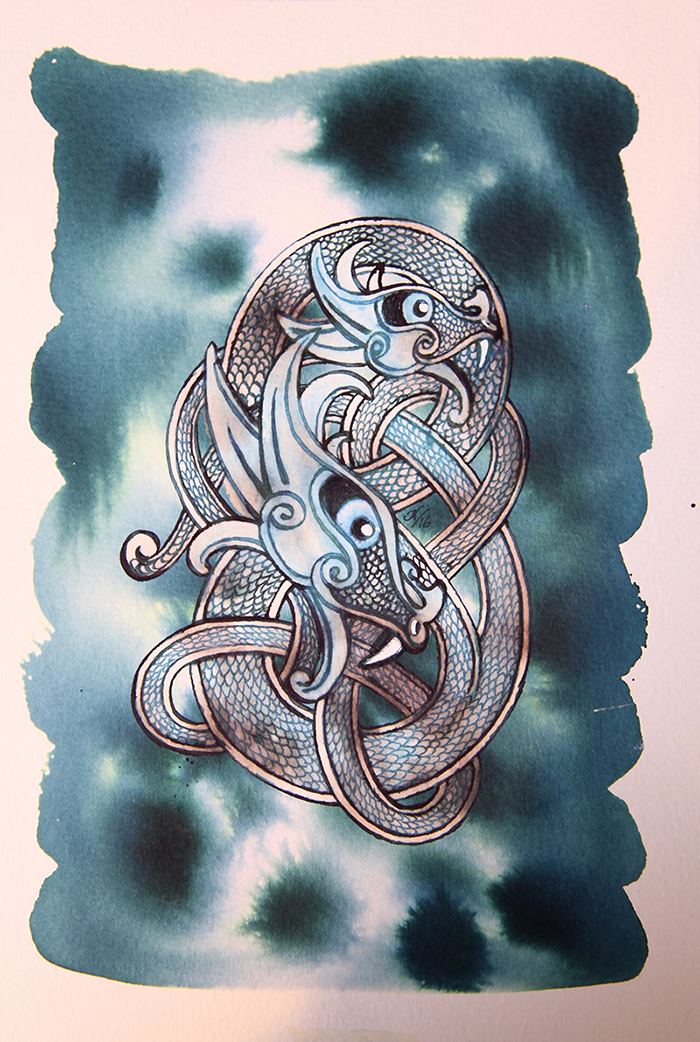
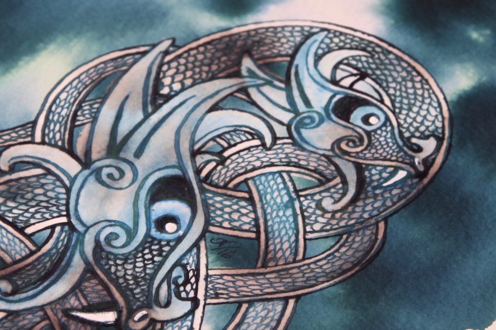
This was a quick test piece ahead of some artwork I have planned for mid March. I used Prime of Commons on top of a Diamine Teal with aim of using bleach on top of the Noodler’s. I ended up with a frothy paste and had to get the roll of paper towel out with some hasty blotting! It ended up looking very flat and washed out! Shame really as the diamine Teal is a dream background. Lesson learned and just as well.
Just to say – this is an ongoing project. It’s all part of a process to look at things in a different way, particularly things that we simply take for granted. I have chosen fountain pen inks which I’m subjecting to household bleach and water. It’s basically random chemistry with no predictable outcomes. But as handwriting gives way to technology, what will happen to all those gorgeous inks? As this project reveals, some inks are just plain boring and do what we naturally assume ink does, so, may well be discontinued? Others, reveal wonderful, magical properties and could hopefully have a future as art materials. And, who knows, someone who sees this project may have a brainwave and apply the concept to some other random things and end up making time travel a reality? Anyway, it’s a little different and all good fun. Keep in touch, the project has a way to go yet and I haven’t even started creating the real art yet. Please click here to view the Mission Statement.
