
To follow on from the amazing Emerald de Chivor was always going to be a challenge but J Herbin haven’t done a bad job.
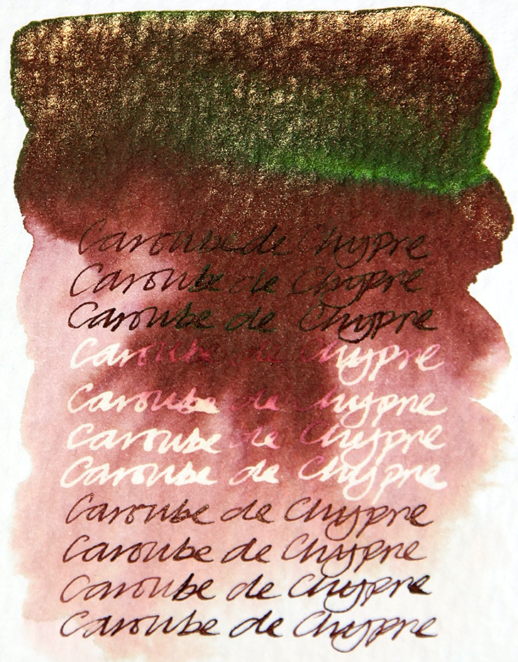
It’s a lovely bark brown, the gold works well and there’s a wonderful metallic green sheen in the heavier inked areas.
When blended with water the colour breaks down into a salmon pink with hints of beige at the outer edges.
When subjected to bleach, there is a reaction in the very light patches but nothing happening in the darker areas.
The J Herbin 1670 Caroube de Chypre is a good addition to the 1670 range but in my opinion it doesn’t trump Emerald de Chivor.
If J Herbin are looking for another colour to add, might I suggest a magenta/purple as this could be a fantastic complimentary colour for the Emerald de Chivor.
And just imagine how visually exciting the combination could be?
Many thanks to Sam Bell at Exaclair for sending me a bottle of the new J Herbin 1670 Caroube de Chypre.
Test conducted on Bockingford watercolour paper.
